 English
  French
  Spanish
  Chinese
  Japanese
  Korean
  Hindi
Hindi  German
  Norwegian
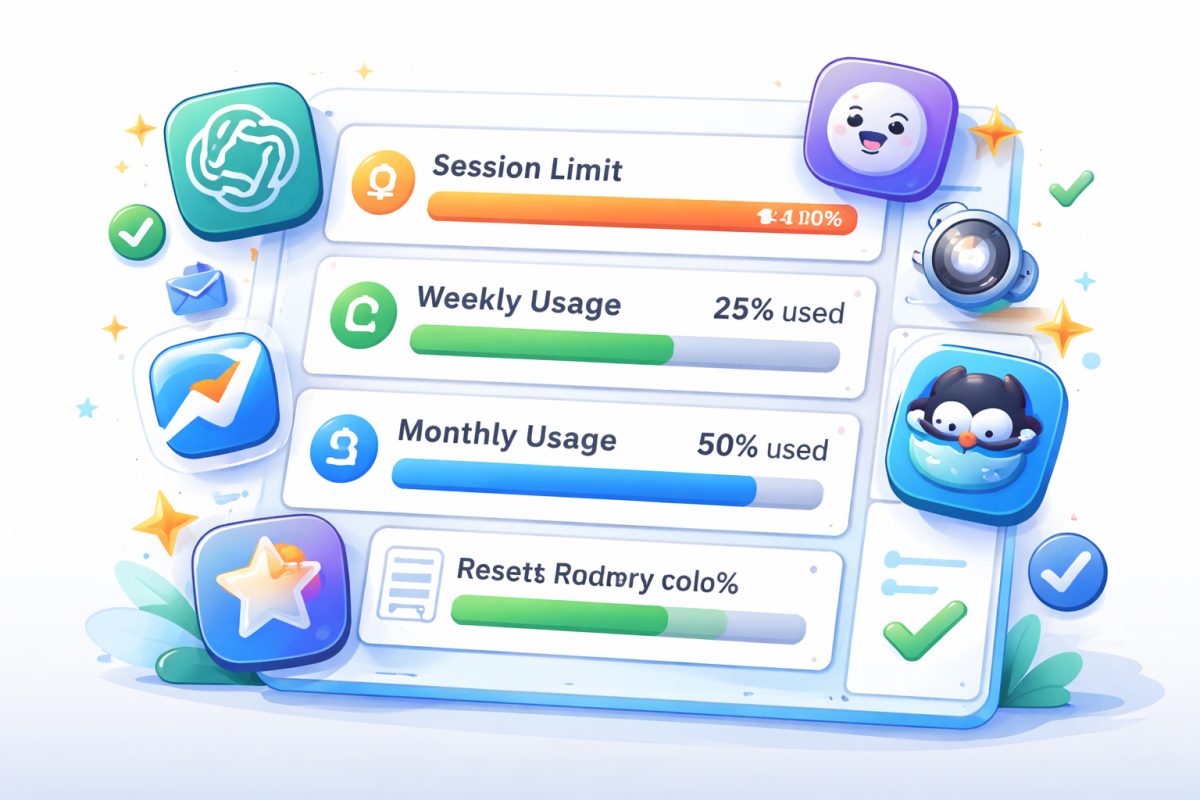
Open letter to everyday AI: give us clear usage gauges at last
Tribune / Open letter
We are asking for one simple thing: clear, consistent, universal gauges that can be understood in a matter of seconds.
Using multiple AI assistants in the same week has become commonplace. We switch from ChatGPT / OpenAI to Claude, then to Kimi, sometimes to GitHub Copilot, or to other specialised tools depending on needs, budget, speed or the type of task at hand.
It's no longer just the quality of responses that differentiates these services. Another issue is becoming increasingly frustrating: no one displays usage limits in the same way.
And over time, it becomes absurd. On one platform, you see a percentage used. On another, a percentage remaining. Elsewhere, a limit of 5 hours. Sometimes a weekly limit. Sometimes both. Sometimes a brief laconic message announces the limit has been reached... without clearly explaining what was consumed, what actually remains, or when it will reset.
The real problem: the user has to guess
The most frustrating thing isn't even the existence of quotas. After all, usage limits can be understood. Models are expensive, resources are not infinite, and some uses are obviously more demanding than others.
The real problem is that users must constantly interpret what they see. They have to do the mental translation work themselves:
- Have I used almost everything, or is almost everything still available?
- Am I blocked for a few hours, or for much longer?
- Does the displayed quota apply to my session, my week, or my entire subscription?
- Do attachments, images, code, or the chosen model consume more?
- At exactly what time does it reset to zero?
This is not a cosmetic detail. It creates frustration, mistrust, and sometimes a sense of arbitrary punishment. When a tool abruptly announces a limit has been reached after just a few exchanges, users often feel they've been caught out by an invisible rule.
A clear gauge should be obvious
In many other digital domains, readability is much better. You know how much battery is left on your phone. You know how much cloud storage is used. You know what's left on your mobile plan.
Why, in the AI sector, which claims to revolutionise everyday life, are we still proposing interfaces where actual consumption resembles an enigma?
The minimum should be standard everywhere, regardless of brand or service.
A proper usage gauge should always display:
- What has been consumed — for example: 13% used
- What remains — for example: 87% remaining
- The exact reset date and time — for example: resets Monday at 10:59 am
We also need to distinguish between types of limits
The confusion also comes from the fact that multiple ceilings can coexist without being clearly separated. A well-designed interface should visually differentiate:
- the short session limit,
- the weekly limit,
- the monthly limit,
- any possible surcharges,
- and the impact of a more resource-intensive premium model.
In short: we need to stop mixing several pieces of information in a display that is too compact or too vague. A good interface doesn't ask its users to be detectives.
This letter is addressed to the entire ecosystem
This request is not aimed at a single player. It concerns OpenAI, Anthropic / Claude, Moonshot / Kimi, GitHub Copilot, and more broadly all publishers of consumer or professional AI assistants.
To all of you, we simply say: stop the ambiguous gauges.
We don't need vague formulations. We don't need alert messages that appear out of context. We don't need elegant but opaque designs.
We need:
- an honest display,
- a consistent vocabulary,
- an immediate read,
- better transparency,
- and ideally a common standard across platforms.
This would be a real product advance
Innovation in AI is often discussed solely from a performance angle: more powerful models, finer responses, longer contexts, more advanced reasoning.
But true innovation isn't just about making the machine more brilliant. It's also about making its use simpler, more human and more readable.
A clear gauge might not change the quality of the model. But it would immediately change the trust relationship with the user. It would reduce frustration. It would avoid misunderstandings. And it would finally give the feeling of mastering one's usage rather than being subject to it.
Artificial intelligence doesn't need to be mysterious to appear powerful.
It has everything to gain by being clear.