 Chinese
  French
  English
  Spanish
  Japanese
  Korean
  Hindi
Hindi  German
  Norwegian
为网站开发一个简单的图形视觉主题
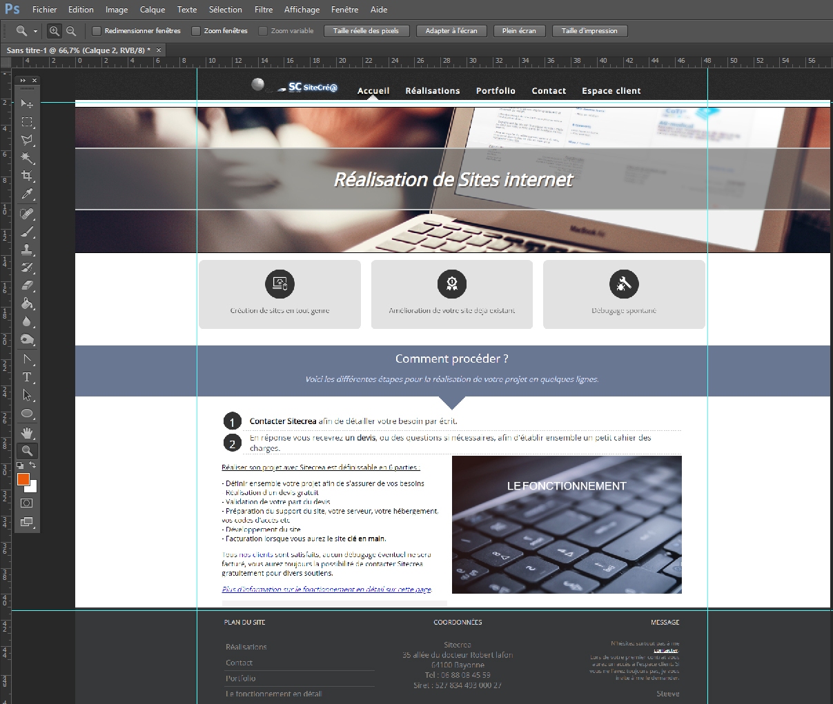
本指南说明如何在 Photoshop 中准备网站每个页面的视觉稿,以便交给开发人员,让他构建不同区域的 HTML 和 CSS 源代码。
这些说明基于您已经掌握 Photoshop 基础操作的前提。
I also apologize in advance for any spelling mistakes that may appear in this article.
开发图形视觉规范前需要准备什么
 Of course, before each project, the ideal is to have a folder on your computer that gathers the different elements, so you can save a lot of time later when finding, organizing and using the different assets.
Before starting, it is preferable to have in your project folder:
- The website logo
- The main color code
- Different content texts (at worst, any text can always be used as a placeholder, but replacing it later may create surprises such as overflow, different area sizes, etc.)
- Different content images
基础
Each page can be viewed in three main formats. That is why, for every page of a website, three different PSD files must be provided:

- One for the desktop version (site visit by a user on a laptop or desktop computer)
- One for the tablet version (less and less popular, but some users still use it.)
- One for the mobile version (more and more visits are made from smartphones.)
格式
The different sizes to use are the following:
Desktop
A width of 1,000px, sometimes 1,200px, but to ensure a good overall result, 1,000px is preferable. Of course, the content must be able to center itself on screens wider than 1,000 pixels, and it will also be possible to choose to automatically adjust the text across the full screen width.
In addition, your Photoshop file should have a larger width, but you will need to use guides to center the content on 1,000px
For example:
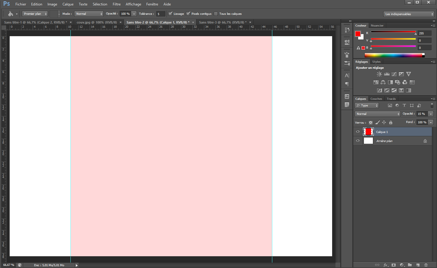
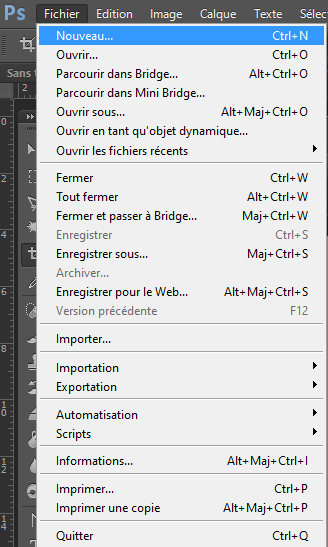
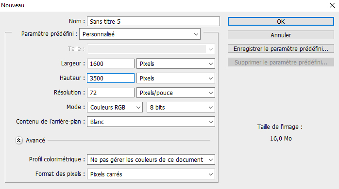
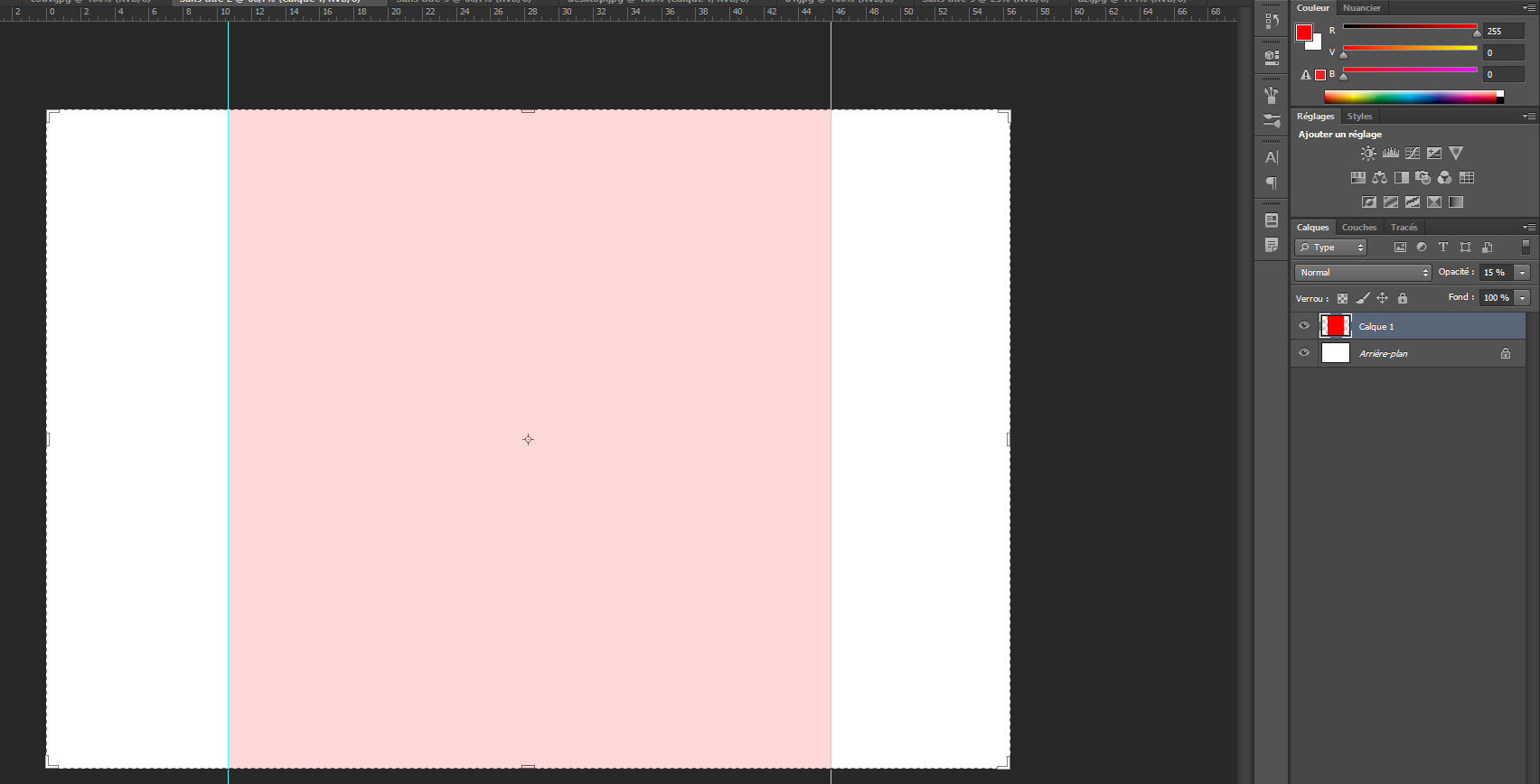
In Photoshop -> File -> New -> Width = 1,600px / Height = 3,500px (adjustable later) -> and always in RGB 8-bit
Once in the file, create another file next to it, but this time -> Width = 1,000px / Height = 700px
Finally, in this 1000px-wide file, fill it with the color of your choice, then ctrl + A (to select all), then ctrl + C (to copy), return to the 1,600px-wide file and press ctrl + V (to paste). This gives you a 1,000px-wide area centered in the middle of your canvas, making it easy to place your guide and always know where the center of the area is.
Tablet
Width of 760px and any height you need. In this 760px area, you should center 740px to leave a 10px margin on each side.
Mobile
Width of 300px with a centered 290px area, leaving 5px margins on the sides. It may be tempting to go beyond 300px because a newer smartphone can handle almost 500px without problems, but no, that is a bad idea, because someone with a standard smartphone would have the content completely shifted.
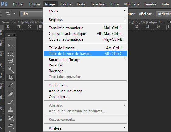
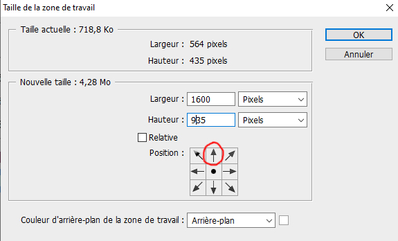
To adjust the height of your file along the way in Photoshop, go to Image -> Canvas Size (alt + ctrl + c) -> choose the height value you want (in centimeters or pixels, it does not matter), and above all remember to click the top arrow in the Position area, to indicate that the starting point is at the top of your image, so the extra height is added downward.
主要结构
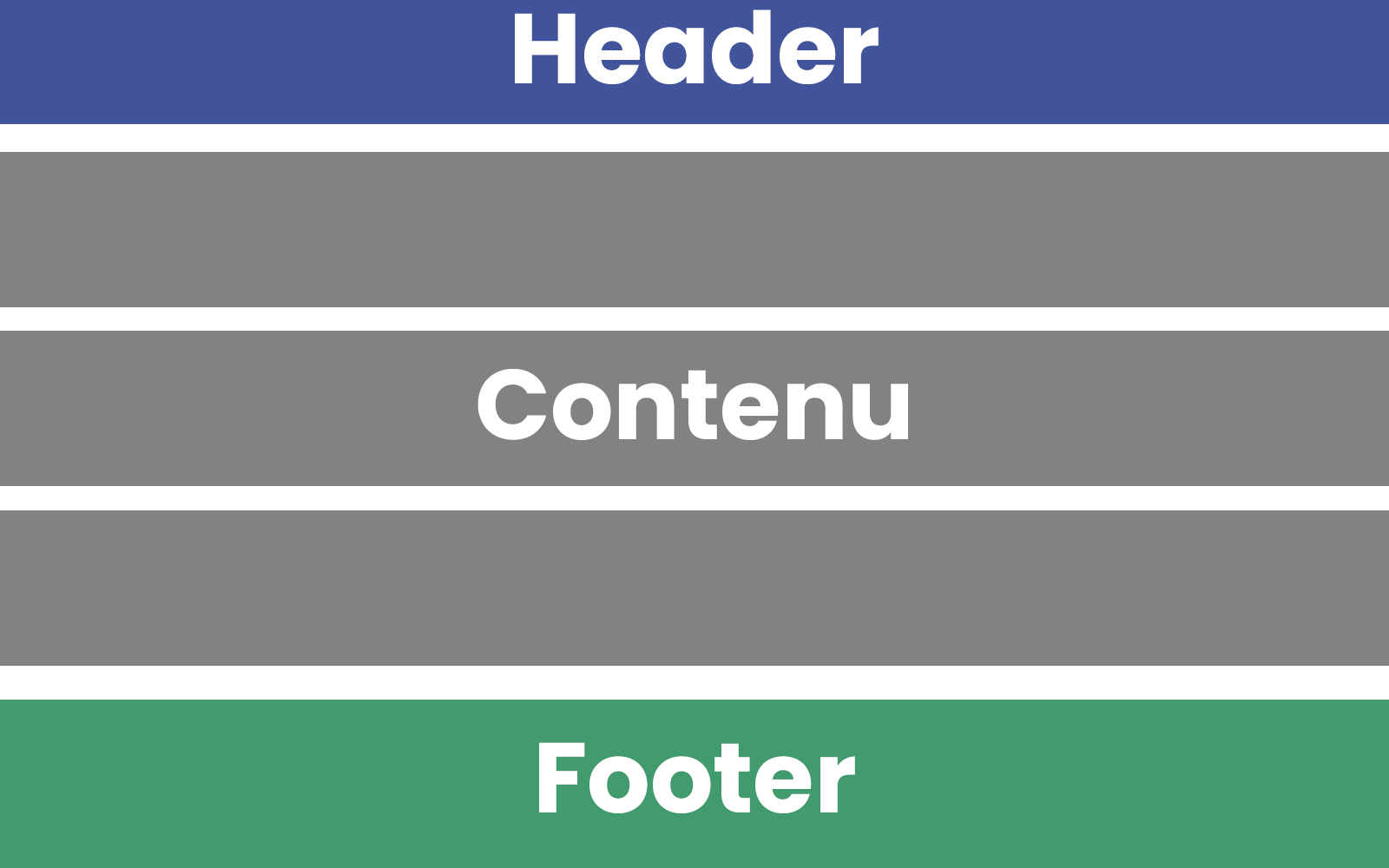
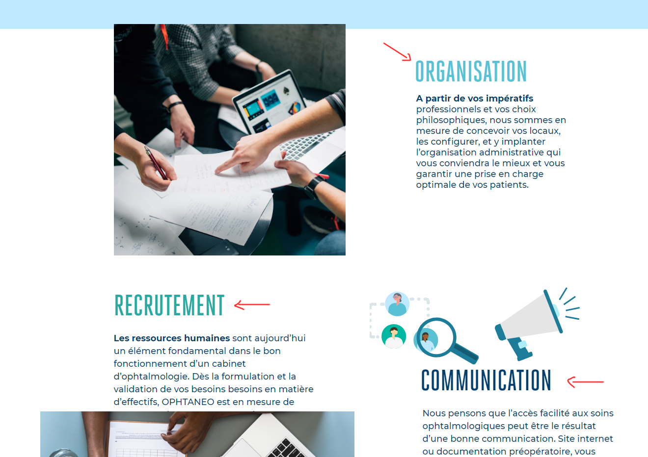
While developing your theme, you can divide your page into three main areas:
- The header: The site header ideally contains the logo, then the menu, and possibly social network logos and other small decorative elements.
- The content: The central content is what changes between pages, and ideally it should follow the rules of the line-by-line concept explained later in this guide.
- The footer: The footer is usually structured in columns, for example 3 columns on desktop, 1 to 3 columns on tablet, and a single column on mobile. The footer follows the same kind of rules as the line-by-line concept.
关于菜单
There are several kinds of menus:
- Basic : Made of simple words aligned vertically. In your visual, however, you must plan three versions for each menu item: a standard version, a hover version when the mouse cursor passes over it, and an active version showing that the current page matches that menu item.
- Advanced : The advanced menu has the same base as the basic menu, but on hover it can open an area below that lists something else. In the Sitecrea CMS, this submenu can be structured in columns, and each column can contain vertically displayed menus or an image.
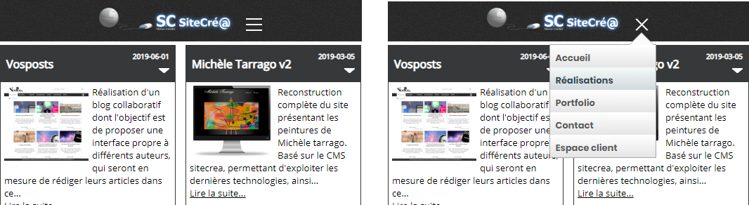
- Mobile : The mobile menu will first be a simple logo made of three vertically stacked lines. When clicking this logo, an expanded area will list a vertical menu in a frame or bubble. It is important to include, in your mobile visual, a version showing the layout of this expanded mobile menu.
逐行概念
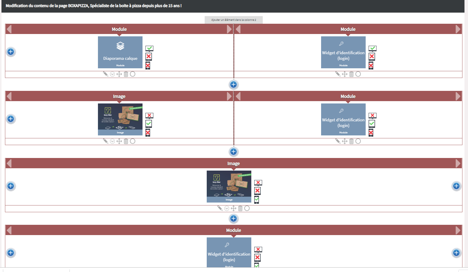
The page management tool available in the Sitecrea CMS allows each row to be defined with 1 to 3 columns of variable width.
For example, if my row has three columns, I can choose the first to be 25% wide, the second 35%, and therefore my third column must necessarily be 40% of the total row width.
Of course, we can also choose to have only one column, which will automatically take 100% of the width.
For each row, we can also choose to center its content or use the full width.
Then, in each column, we can choose to display only one type of element.
The possible element types may be the following:
- A raw text area or HTML content (to be avoided as much as possible to make life easier)
- A title (which will be displayed in h1 format)
- An image
- An editorial article (to be used as much as possible so the article can easily be edited without touching the page structure)
- An editorial article category (which will list all articles inside that category)
- Module (depending on the components installed in the Sitecrea CMS, several options will be offered, each module displaying various systems such as a form, newsletter, etc.)
- Automatic formatting (including some basic formatting suggestions to quickly add text)
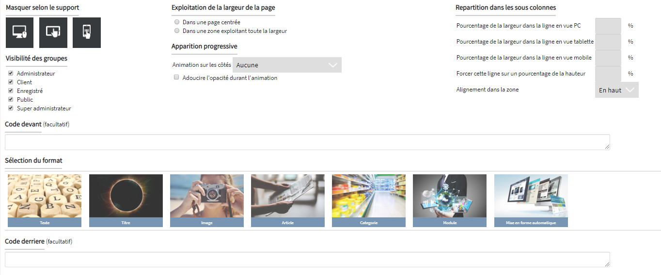
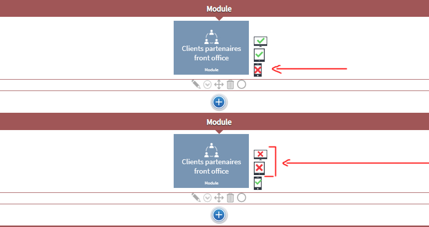
Finally, each element in a column can be set to appear or not on a given display format.
For example, if in my row of three columns I choose not to display the first two columns, only the third column will be visible on smartphones. Conversely, I can choose to display elements from a row only on tablet or desktop.
Thus, for an easy-to-use structure, it is possible to display the same content 3 times in different places, each visible only on tablet, desktop or mobile.
简化
Complications arise when, for example, in the 4th row block of my content, I want the title to be no longer blue but orange, or a certain text to be no longer 12px but 14px.
This kind of need creates a special case.
For now, the system does not yet allow specific settings to be defined for each element, but this could be a future improvement.
In the meantime, if a special case must be created, the developer will need to define in the CSS source code that a specific area of a specific page, for a specific type of element, must cancel one parameter and add another.
So if we want to keep things simple, every title and every content block must respect the same formatting for each display format.
Of course, a title displayed on mobile will not necessarily have the same size as a title on tablet or desktop, but all mobile titles will follow the same basic formatting unless a special case is created.
结论
To summarize, if you are creating the visual for the homepage of a website, you will need to make 3 visuals in Photoshop (desktop, tablet, mobile). In each visual, you need three main areas: Header, Footer and Content.
For all your other pages, you will only need to modify the content area and duplicate your file under another name. So the first page will take much longer to create than the others.
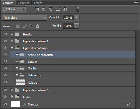
During your creation, you should use Photoshop internal folders to group your different layers, and name your layers so that you can find your way around, but also so the person who must inspect the elements can identify font sizes used, etc.
For example, your Header should have all its layers grouped in one folder, and the same goes for your footer.
If your theme contains a font other than Arial or Times New Roman, which is very likely, you will also need to provide, along with the PSD files, the font installation files in TTF or OTF format (which corresponds to the universal web format). Otherwise, another PC opening your PSD files without the fonts installed will see completely different content. In addition, the font files will need to be integrated into the theme developed on the website.
These are the first rules to follow when developing a theme for the Sitecrea CMS, but most of them apply to any theme elsewhere.

为网站开发一个简单的图形视觉主题
本指南说明如何在 Photoshop 中准备网站每个页面的视觉稿,以便交给开发人员,让他构建不同区域的 HTML 和 CSS 源代码。
这些说明基于您已经掌握 Photoshop 基础操作的前提。
I also apologize in advance for any spelling mistakes that may appear in this article.
开发图形视觉规范前需要准备什么
Of course, before each project, the ideal is to have a folder on your computer that gathers the different elements, so you can save a lot of time later when finding, organizing and using the different assets.Before starting, it is preferable to have in your project folder:
- The website logo
- The main color code
- Different content texts (at worst, any text can always be used as a placeholder, but replacing it later may create surprises such as overflow, different area sizes, etc.)
- Different content images
基础
Each page can be viewed in three main formats. That is why, for every page of a website, three different PSD files must be provided:
- One for the desktop version (site visit by a user on a laptop or desktop computer)
- One for the tablet version (less and less popular, but some users still use it.)
- One for the mobile version (more and more visits are made from smartphones.)
格式
The different sizes to use are the following:
Desktop
A width of 1,000px, sometimes 1,200px, but to ensure a good overall result, 1,000px is preferable. Of course, the content must be able to center itself on screens wider than 1,000 pixels, and it will also be possible to choose to automatically adjust the text across the full screen width.
In addition, your Photoshop file should have a larger width, but you will need to use guides to center the content on 1,000px
For example:
In Photoshop -> File -> New -> Width = 1,600px / Height = 3,500px (adjustable later) -> and always in RGB 8-bit
Once in the file, create another file next to it, but this time -> Width = 1,000px / Height = 700px
Finally, in this 1000px-wide file, fill it with the color of your choice, then ctrl + A (to select all), then ctrl + C (to copy), return to the 1,600px-wide file and press ctrl + V (to paste). This gives you a 1,000px-wide area centered in the middle of your canvas, making it easy to place your guide and always know where the center of the area is.
Tablet
Width of 760px and any height you need. In this 760px area, you should center 740px to leave a 10px margin on each side.
Mobile
Width of 300px with a centered 290px area, leaving 5px margins on the sides. It may be tempting to go beyond 300px because a newer smartphone can handle almost 500px without problems, but no, that is a bad idea, because someone with a standard smartphone would have the content completely shifted.
To adjust the height of your file along the way in Photoshop, go to Image -> Canvas Size (alt + ctrl + c) -> choose the height value you want (in centimeters or pixels, it does not matter), and above all remember to click the top arrow in the Position area, to indicate that the starting point is at the top of your image, so the extra height is added downward.
主要结构
While developing your theme, you can divide your page into three main areas:
- The header: The site header ideally contains the logo, then the menu, and possibly social network logos and other small decorative elements.
- The content: The central content is what changes between pages, and ideally it should follow the rules of the line-by-line concept explained later in this guide.
- The footer: The footer is usually structured in columns, for example 3 columns on desktop, 1 to 3 columns on tablet, and a single column on mobile. The footer follows the same kind of rules as the line-by-line concept.
关于菜单
There are several kinds of menus:
- Basic : Made of simple words aligned vertically. In your visual, however, you must plan three versions for each menu item: a standard version, a hover version when the mouse cursor passes over it, and an active version showing that the current page matches that menu item.
- Advanced : The advanced menu has the same base as the basic menu, but on hover it can open an area below that lists something else. In the Sitecrea CMS, this submenu can be structured in columns, and each column can contain vertically displayed menus or an image.
- Mobile : The mobile menu will first be a simple logo made of three vertically stacked lines. When clicking this logo, an expanded area will list a vertical menu in a frame or bubble. It is important to include, in your mobile visual, a version showing the layout of this expanded mobile menu.
逐行概念
The page management tool available in the Sitecrea CMS allows each row to be defined with 1 to 3 columns of variable width.
For example, if my row has three columns, I can choose the first to be 25% wide, the second 35%, and therefore my third column must necessarily be 40% of the total row width.
Of course, we can also choose to have only one column, which will automatically take 100% of the width.
For each row, we can also choose to center its content or use the full width.
Then, in each column, we can choose to display only one type of element.
The possible element types may be the following:
- A raw text area or HTML content (to be avoided as much as possible to make life easier)
- A title (which will be displayed in h1 format)
- An image
- An editorial article (to be used as much as possible so the article can easily be edited without touching the page structure)
- An editorial article category (which will list all articles inside that category)
- Module (depending on the components installed in the Sitecrea CMS, several options will be offered, each module displaying various systems such as a form, newsletter, etc.)
- Automatic formatting (including some basic formatting suggestions to quickly add text)
Finally, each element in a column can be set to appear or not on a given display format.
For example, if in my row of three columns I choose not to display the first two columns, only the third column will be visible on smartphones. Conversely, I can choose to display elements from a row only on tablet or desktop.
Thus, for an easy-to-use structure, it is possible to display the same content 3 times in different places, each visible only on tablet, desktop or mobile.
简化
Complications arise when, for example, in the 4th row block of my content, I want the title to be no longer blue but orange, or a certain text to be no longer 12px but 14px.
This kind of need creates a special case.
For now, the system does not yet allow specific settings to be defined for each element, but this could be a future improvement.
In the meantime, if a special case must be created, the developer will need to define in the CSS source code that a specific area of a specific page, for a specific type of element, must cancel one parameter and add another.
So if we want to keep things simple, every title and every content block must respect the same formatting for each display format.
Of course, a title displayed on mobile will not necessarily have the same size as a title on tablet or desktop, but all mobile titles will follow the same basic formatting unless a special case is created.
结论
To summarize, if you are creating the visual for the homepage of a website, you will need to make 3 visuals in Photoshop (desktop, tablet, mobile). In each visual, you need three main areas: Header, Footer and Content.
For all your other pages, you will only need to modify the content area and duplicate your file under another name. So the first page will take much longer to create than the others.
During your creation, you should use Photoshop internal folders to group your different layers, and name your layers so that you can find your way around, but also so the person who must inspect the elements can identify font sizes used, etc.
For example, your Header should have all its layers grouped in one folder, and the same goes for your footer.
If your theme contains a font other than Arial or Times New Roman, which is very likely, you will also need to provide, along with the PSD files, the font installation files in TTF or OTF format (which corresponds to the universal web format). Otherwise, another PC opening your PSD files without the fonts installed will see completely different content. In addition, the font files will need to be integrated into the theme developed on the website.
These are the first rules to follow when developing a theme for the Sitecrea CMS, but most of them apply to any theme elsewhere.