
 English
  French
  German
  Spanish
  Hindi
Hindi  Italian
  Japanese
  Korean
  Norwegian
  Chinese
A map always chooses a side
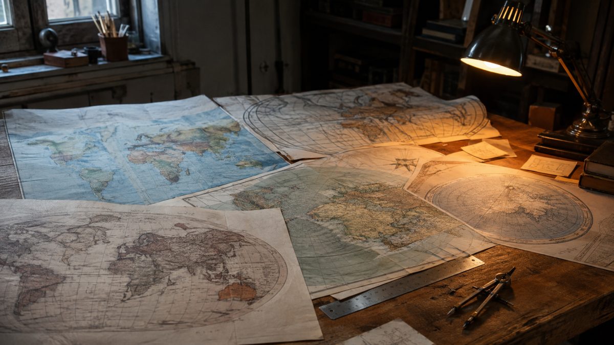
Activist counter-maps have a rare virtue: they make visible what an ordinary map manages to make us forget. They shift the center, change names, enlarge what had been relegated to the margins, and bring peoples or territories left outside the frame back into view. Their gesture is not merely graphic. It reminds us that a map never shows “the world” in general. It shows a world organized by someone, for a given purpose, from a particular position.
That is precisely why they are unsettling. An official or familiar map seems natural because its choices have become invisible. A counter-map, by contrast, puts the choice on display. It does not claim to eliminate bias; it proposes another one. Geographer Mark Monmonier showed that it is possible to “lie with maps.” But the deeper problem may not be deliberate falsehood. It is the trust placed in old conventions simply because they look scientific.
Cartographic neutrality is a technical impossibility
Representing a spherical Earth on a flat surface necessarily means distorting something. Angles, directions, certain distances, or areas can be preserved, but not all at once. Added to this geometric constraint are decisions that do not belong to mathematics: what is placed at the center? Where is the world cut? Which side is at the top? What scale makes a territory immediately visible or, on the contrary, almost negligible?
North at the top now seems self-evident to us. Yet the photograph Blue Marble, taken in 1972 during the Apollo 17 mission, originally showed the South Pole at the top and Africa in the center. The image was often turned around to match Western conventions. The Earth itself had obviously not changed. Only the viewpoint deemed acceptable had been restored.
Older maps embraced this staging more openly. The Peutinger Table placed Rome at the center of the known world. Martin Behaim’s Erdapfel globe, made in 1492, did not depict the Americas, still unknown to Europeans, and populated some uncertain regions with mythical creatures. These objects were not poor versions of a perfect map yet to come. They expressed the limits of available knowledge, but also the political and cultural hierarchy of those who produced them.
A map does not merely reduce the world: it decides what deserves to be enlarged.
Mercator: a maritime solution turned political vision
The projection developed by Gerardus Mercator in 1569 had a practical goal: to make maritime navigation easier. It preserves angles and turns routes followed at a constant bearing, known as rhumb lines, into straight lines. For a navigator, this property is extraordinarily useful. The problem begins when this specialized tool becomes a general image of the world.
The farther one moves from the equator, the more areas are enlarged. The poles themselves cannot be represented: they would have to stretch across the entire width of the map. Greenland therefore ends up looking comparable in size to Africa, even though Africa is actually fourteen times larger. Europe and the countries of the North visually occupy more space; much of the South appears reduced.
It would be too simple to claim that Mercator designed his projection as a poster for colonial propaganda. The available facts first establish its nautical purpose. Its spread as a schoolroom and global standard, however, took place over a long period of maritime expansion, slavery, and European colonial hegemony. That is where its use becomes political: a distortion technically justified for navigation ends up providing, generation after generation, a visual hierarchy of the globe.
A map therefore does not need to have been created with malicious intent to produce an ideological effect. Its original function merely has to be forgotten. A wrench is not a bad hammer; it becomes one when we decide it should be used for everything. Mercator is not a false map. It is a map that became pervasive.
Change the projection, change the story
In 1974, Arno Peters proposed an alternative projection that notably restores Africa’s true share of surface area. This reversal does not finally provide access to an absolutely neutral view. It simply chooses to preserve something else. The shapes become less familiar, but the relative sizes are no longer as misleading.
Contemporary counter-maps extend this gesture. Initiatives such as Turtle Island or the Decolonial Atlas incorporate previously excluded viewpoints and challenge established assumptions. Their value does not lie only in “correcting” an old map. They show that the decisive question is always the same: who has the power to name, center, and make visible?
- A projection chooses what it preserves and what it distorts.
- Centering turns one territory into the heart of the world and the others into peripheries.
- An orientation eventually seems natural once it has been repeated for long enough.
Google Maps has not removed politics from maps
Since its launch in 2005, Google Maps has profoundly changed our navigation habits. A map is no longer merely consulted: it accompanies movement, suggests routes, organizes the search for places, and redefines our everyday relationship with territory. This efficiency strengthens its appearance of neutrality. Because the blue dot seems exact, everything else appears objective.
Yet the tool inherits older conventions: north placed at the top, Western projection habits, and a world divided and presented according to choices that have become so familiar that they are no longer perceived as choices. An algorithmic layer is added to this historical one. The data flows produced by Google Maps can be used by companies such as Uber to analyze behavior and optimize their services. A digital map therefore does not merely describe space; it participates in its economic organization.
The same mechanism appears in a daily weather map. The chosen frame generally places our territory at the center, while what happens beyond it becomes marginal or disappears. This is not necessarily manipulation. It is a practical decision. But repeated every day, that decision builds a mental geography: the important world is here, and the outside begins there.
The power of digital maps lies in this combination. They are extremely precise locally, but that precision masks global choices. We readily discuss the suggested route, but rarely the implicit world in which that route takes place. The screen gives us the impression that the map has faded behind the service. In reality, it has become even more influential.
Reading a map means learning to see its invisible author
The point is not to suspect every subway map or weather report of being a propaganda operation. It is to recover a basic critical reflex. What is this map for? What does it preserve? What does it distort? Who is placed at the center? What reality disappears at the edge?
Counter-maps are useful precisely because they reintroduce these questions into images that have become too self-evident. They do not prove that all maps are equivalent. Some are more accurate for measuring areas, while others are better suited to navigation. They prove that no map can be accurate in every respect, everywhere, and for everyone.
Maps therefore do not always lie in the ordinary sense of the term. They select, compress, and rank. Their truth is conditional: true for one use, from one viewpoint, at the cost of distortion elsewhere. The real danger begins when that condition disappears from our memory. At that point, a historical convention passes itself off as the natural shape of the world.